韦恩图
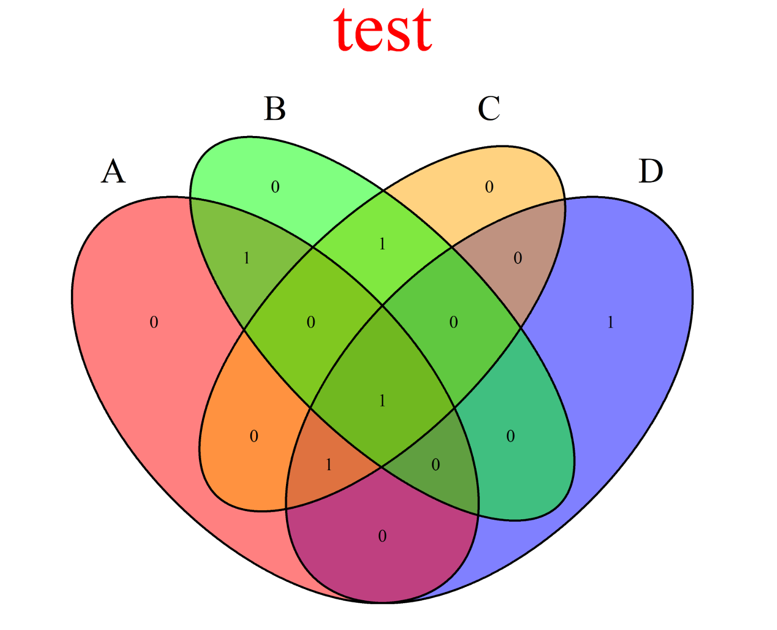
在R语言中绘制韦恩图通常有两种方法,小于5个集合的用R包VennDiagram即可完成绘制;超过5个的使用R包UpSetR进行绘制。
VennDiagram
1 | |
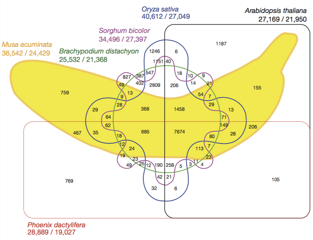
当集合很多的时候怎么办?下面这个图是2012年Nature**上的图$^{[1]}$,看起来真的是好复杂啊!这时候就该UpSet上场了。
UpSetR
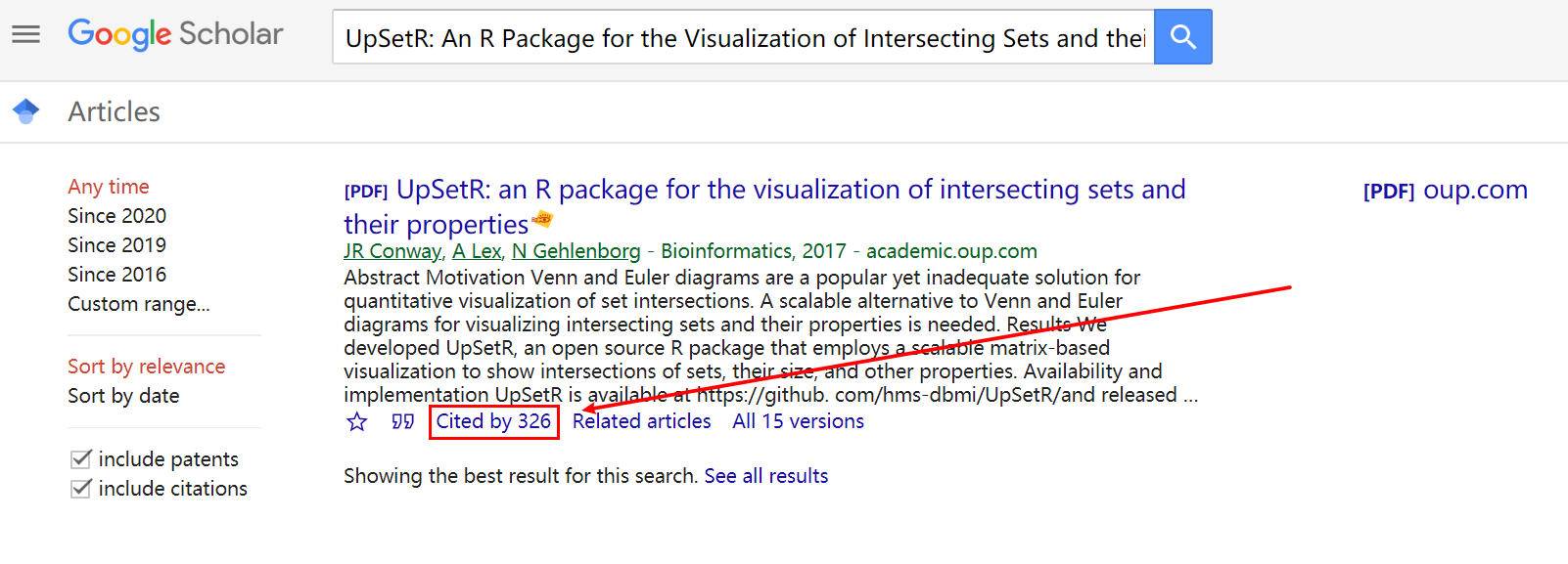
UpSetR有对应的网站:http://caleydo.org/tools/upset/。还有Shiny APP:https://gehlenborglab.shinyapps.io/upsetr/。R包的使用可以参考对应的GitHub:https://github.com/hms-dbmi/UpSetR。也有开发者使用Python开发了对应的Python应用:https://github.com/ImSoErgodic/py-upset。
其中,Shiny APP的示例视频是YouTube上的,我把它下载上传到腾讯视频了,点击观看即可。
YouTube观看地址:https://www.youtube.com/watch?v=-IfF2wGw7Qk&t=188s
腾讯视频观看地址:https://v.qq.com/x/page/l09525p5h4q.html
1 | |

下面这段代码可以展示更多内容:
1 | |
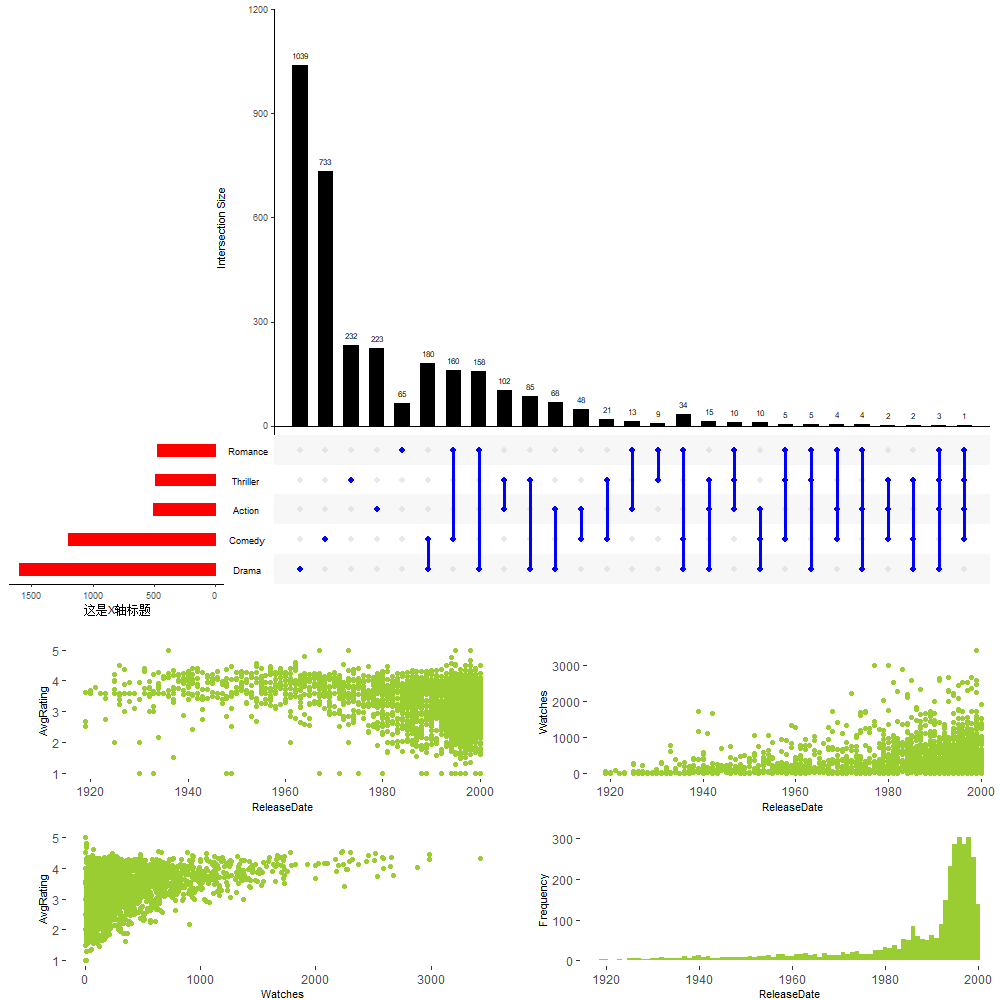
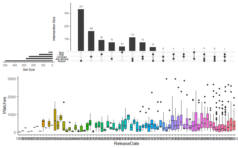
我觉得最酷炫的地方在于可以自定义下方附图函数,展示想要的任何图像:
1 | |
参考文献
[1] D’hont, Angélique, et al. "The banana (Musa acuminata) genome and the evolution of monocotyledonous plants." Nature 488.7410 (2012): 213-217.
💌lixiang117423@foxmail.com
💌lixiang117423@gmail.com